Westpak is an established product and package testing company with an established clientelle, who wanted to reface their brand to a brighter, more modern brand.
I had the opportunity to lead our branding efforts as lead designer, under the direction of our art director. I absolutely loved this rebranding effort. When pitching this direction, I likened the approach to a dusty vs clean package. The old brand was very cluttered, the website was a mess, and felt very old and outdated. This new approach needed to feel like a clean, shiny package. Imagine receiving a package from the a company who guarantees the best quality output. One wouldn’t want a package covered in dust or dinged up. My goal was to make this “package” (aka this brand) feel extremely clean, very breathable, with easy to navigate to the many options their website has.
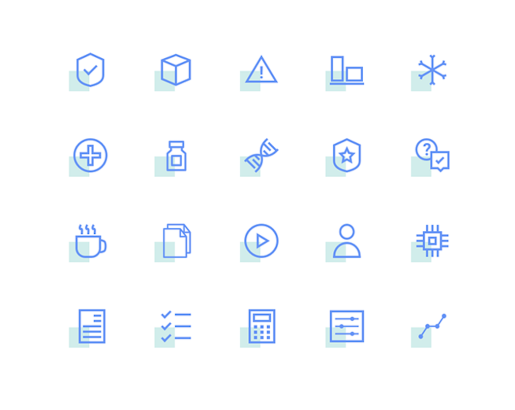
Custom drawn icons for the website.
Screen recording show the homepage and testing services design.
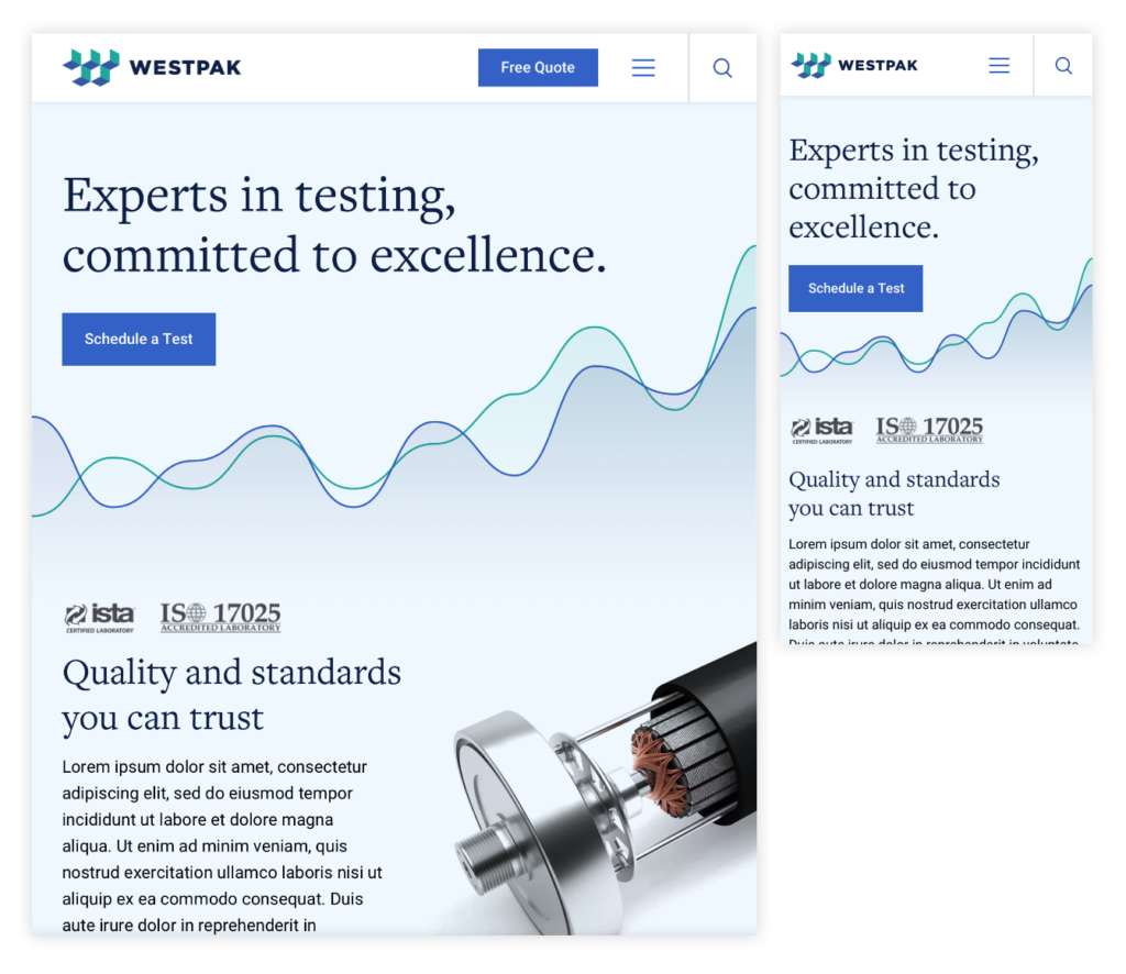
The website was designed in all breakpoints before handing off to our development team.
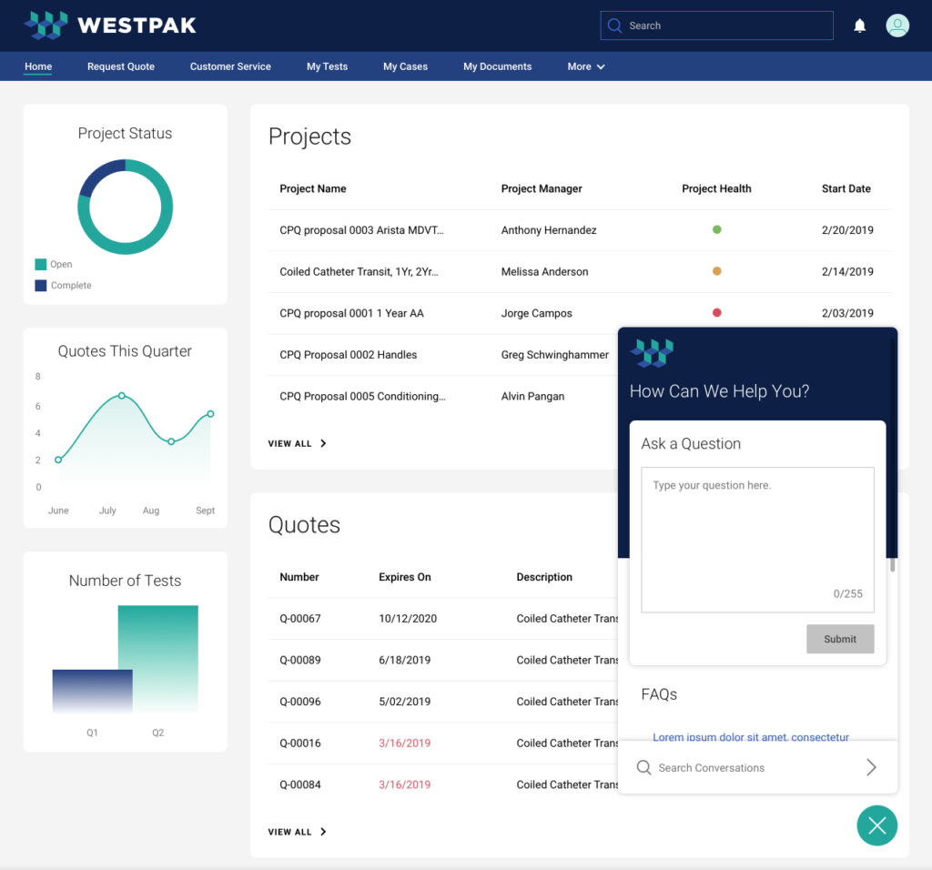
Dashboard for their internal team to seamlessly track tests and statuses of each project.
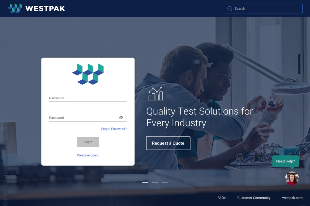
As bland as dashboards can get, I love designing the login screen(s) to really show the brand and be more aesthetically pleasing.


