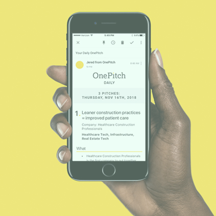
OnePitch solves a common issue Publicists and Journalists deal with on a daily basis. Publicists are constantly seeking the best stories, and can spend a long time finding a story within their realm of interest. Journalists on the other hand, get bombarded with pitches that either don’t interest them or are simply not something they want to write about. This ends up adding countless hours of vetting through pitches before they find “the one” to snatch up.
As a solve, OnePitch came to our team at BL3NDlabs to solve this by creating smart tech and beautiful design. While our tech team created a wonderful strategy behind the tech stack and products desired, the design team set forth to develop their brand, and create beautiful UI elements.
The biggest goal for this product was simplicity. Because the product itself is aimed at greatly simplifying this process, we wanted our design to feel extremely accessible and dummy proof.

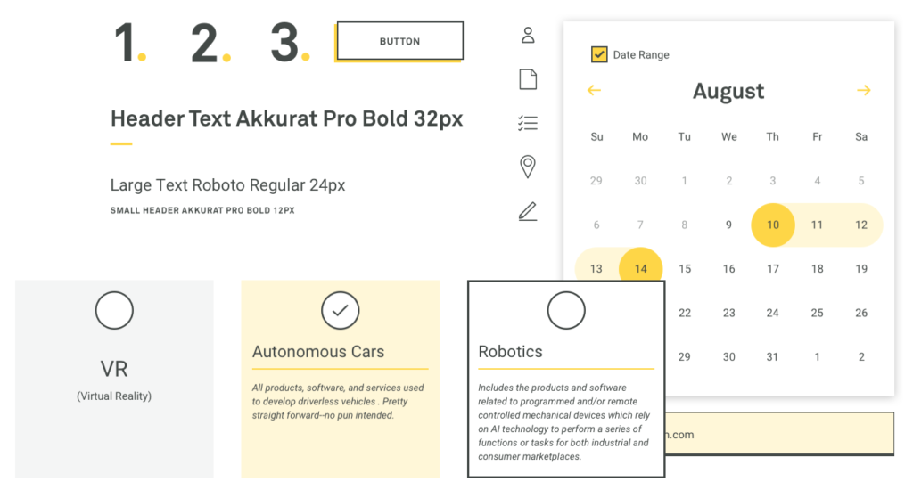
We explored different aesthetics, such as really large input fields and buttons to make it almost feel as if your 5 year old could use this platform. The client ended up picking a more sophisticated approach (still based on simplicity and accessiblity). They fell in love with our more “stark” color palette of yellows and blacks, and were thrilled with the outcome.
Case study designed for BL3NDlabs
I had a ton of fun working on this case study (I didn’t say my buddy who developed this had as much fun haha). As a way to create an immersive experience for the user on our case study at BL3NDlabs, I wanted show pitches being vetted or filtered in a visually interesting and captivating way. After much trial and error with our rockstar developer, we were able to produce fun scrolling experience, showing the “approved pitches” (yellow boxes) being filtered (the filter is the yellow lines intersecting) into the box; representing those using “OnePitch”, while the “irrelevant pitches” (gray boxes) are filtered away from “OnePitch”.


